Overview
Narrow the options before asking users to browse.
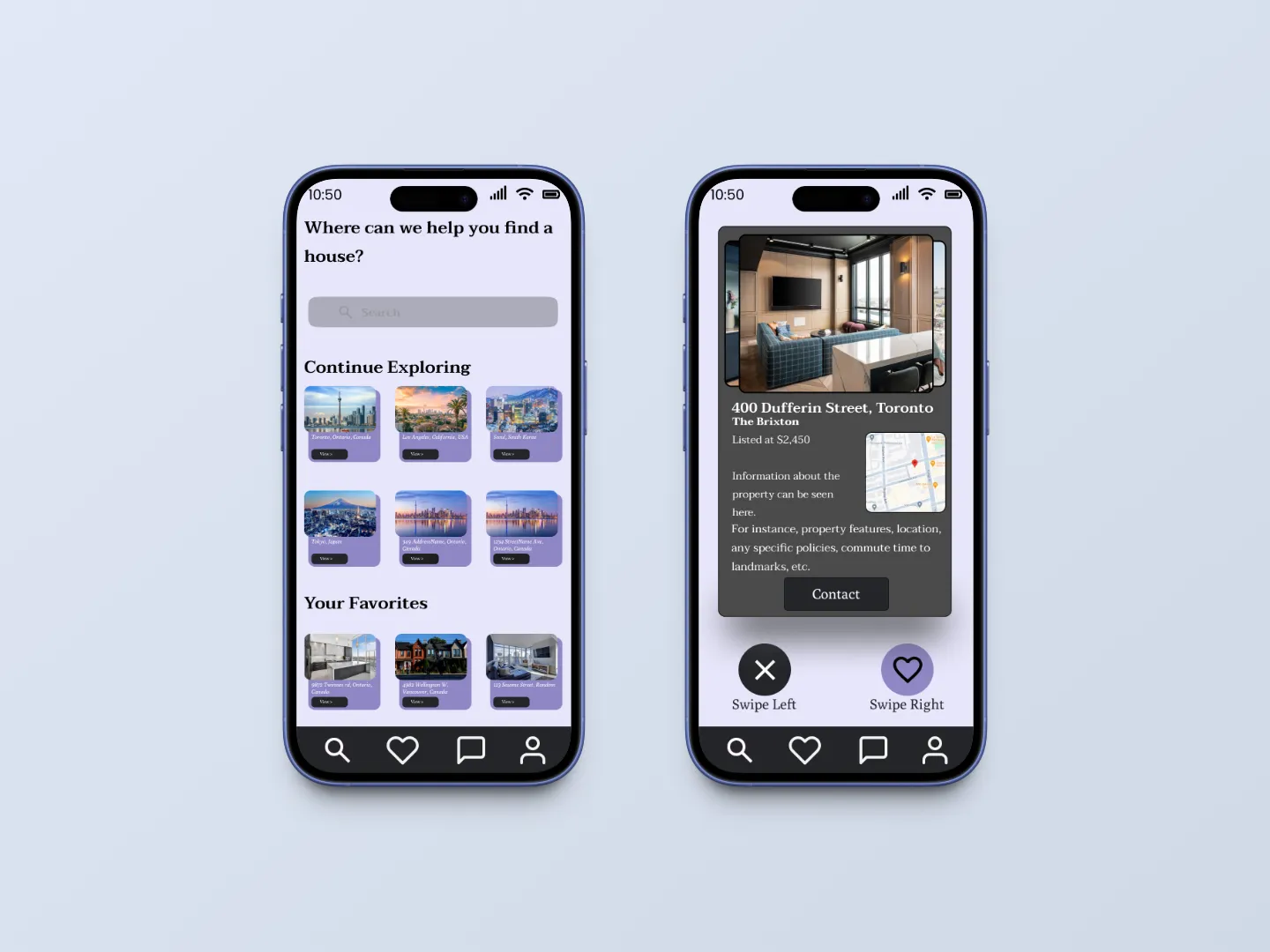
EasyRent is a solo mobile rental-search concept that filters listings before browsing. Users set preferences, review matching properties, save promising options and contact owners in-app.
Design goal
Challenge
Rental search involves repeated filtering and comparison
Users can spend time browsing irrelevant listings and repeatedly adjusting filters before finding suitable options.
Relevance
How can users see fewer properties that don't match their needs?
Speed
How can matches be evaluated without browsing long feeds?
Continuity
How can saved properties and owner communication stay connected?
Scope
The prototype covered preference setting, browsing, saving and messaging. Listing data, payments and production development were outside scope.
Process
I used desk research to frame the concept, then moved through flows, prototyping and usability testing.
Frame the problem
- Reviewed rental-search, filtering and swipe interaction patterns.
Define the flows
- Mapped preference setting, browsing, saving and owner contact.
Prototype
- Moved from early sketches to a high-fidelity Figma prototype.
Test
- Five participants completed 30–40 minute think-aloud sessions.
Key decisions
Filter before browsing. Users set key criteria first so irrelevant options disappear before comparison begins.
Trade-off. More setup before the first result.
Use swiping for quick comparison. Matching properties appear one at a time to like or pass, with liked properties saved automatically.
Trade-off. A familiar gesture can be unclear in a rental context.
Keep messaging tied to saved properties. Users can contact owners directly from listings and saved properties.
Trade-off. Testing showed that owner-focused messaging could lose the property context.
Solution
A preference-first rental flow
Set preferences
Narrow by location, price, bedrooms and amenities.
Browse matches
Review matching properties one at a time.
Save and contact
Revisit promising properties and message the owner.
Testing the prototype
Five participants completed three think-aloud tasks in 30–40 minute sessions.
100%
set rental preferences
5 out of 5 participants.
80%
browsed and swiped through listings
4 out of 5 participants.
80%
reviewed saved properties and contacted an owner
4 out of 5 participants.
What worked
- Preference setting was clear. All five participants completed the flow.
- Swiping made browsing engaging. Most participants understood and enjoyed the interaction.
- Saved properties were easy to reach. Most participants completed the final flow.
What needed work
Swipe hesitation
The gesture was familiar, but its meaning in a rental context wasn’t obvious.
Next iteration. Add a brief first-use cue.
Owner confusion
Some participants struggled to connect an owner’s name with the property.
Next iteration. Keep the property thumbnail and address visible in the conversation.
Low filter contrast
Some options were difficult to distinguish visually.
Next iteration. Increase contrast on the preferences screen.
Outcome
A tested concept with three clear priorities.
Testing gave the concept a clear direction for another iteration:
- Keep the preference-first model. All five participants completed setup.
- Teach the swipe interaction. First-time use wasn’t always obvious.
- Add context to messaging. Users needed a clearer link between owner and listing.
Study limitations
- A small sample. Five participants
- A limited demographic. Participants were students and alumni.
- No comparison test. The swipe model wasn’t tested against a conventional listing flow.
Reflection
Faster interactions still need orientation
The swipe model made browsing feel quicker, but testing showed that speed only helps when users understand the interaction.
- Test the core interaction earlier. The swipe model made browsing feel quicker, but testing showed that speed only helps when users understand the interaction.
- Recruit beyond my immediate audience. Include working professionals, relocators and other renters who better represent the broader market.