Overview
Giving a new product a clear public home.
Squirl Signs is developing real-time ASL-to-English translation technology. I joined as the solo UX/UI designer and Framer developer, responsible for the site's structure, content direction, visual design and build.
The co-founder reached out for advice on launching a public website quickly. I recommended Framer for its speed and cost, then took the project through launch.
Design goal
Challenge
Three audiences, one unfamiliar technology, and no product visuals.
The site had to serve three groups:
- Potential users, including the Deaf community: Understand what the product does and whether to trust it.
- Investors: See progress and direction.
- Partners: Understand the opportunity and how to get involved.
With no final product visuals, team photography or demo footage to rely on, clear language and information hierarchy had to do most of the work.
How I decided who the Home page was for
I prioritized first-time visitors and potential users on Home, while moving deeper product and roadmap information one level down.
Research scope. stakeholder interviews and a review of the unreleased site. I did not test with Deaf or hard-of-hearing users.
Process
Kickoff and audit
- Interviewed the co-founder and reviewed the unreleased site to clarify goals and gaps.
Structure
- Mapped the current and proposed information architecture to separate first-time visitor needs from deeper product and company information.
Build
- Built Home, Product, About and Contact in Framer while establishing the site's visual direction.
Refine
- Iterated through stakeholder reviews on content, imagery, branding and calls to action.
Key decisions
Lead Home with a one-line value proposition. New visitors first needed to understand what Squirl Signs does.
Trade-off. Technical detail moved to deeper pages.
Separate product and company information. Home stayed focused on the product, while About and Product carried the deeper story.
Trade-off. Some information required an extra click.
Surface the roadmap. The roadmap gave partners and investors a clearer view of direction without overloading Home.
Trade-off. Roadmaps create expectations and require careful updates.
Use lavender only as an accent. I kept the existing purple identity but limited lighter lavender to decorative use because it lacked sufficient text contrast.
Solution
I mapped each core visitor question to a predictable place:
What does it do? / Who is it for?
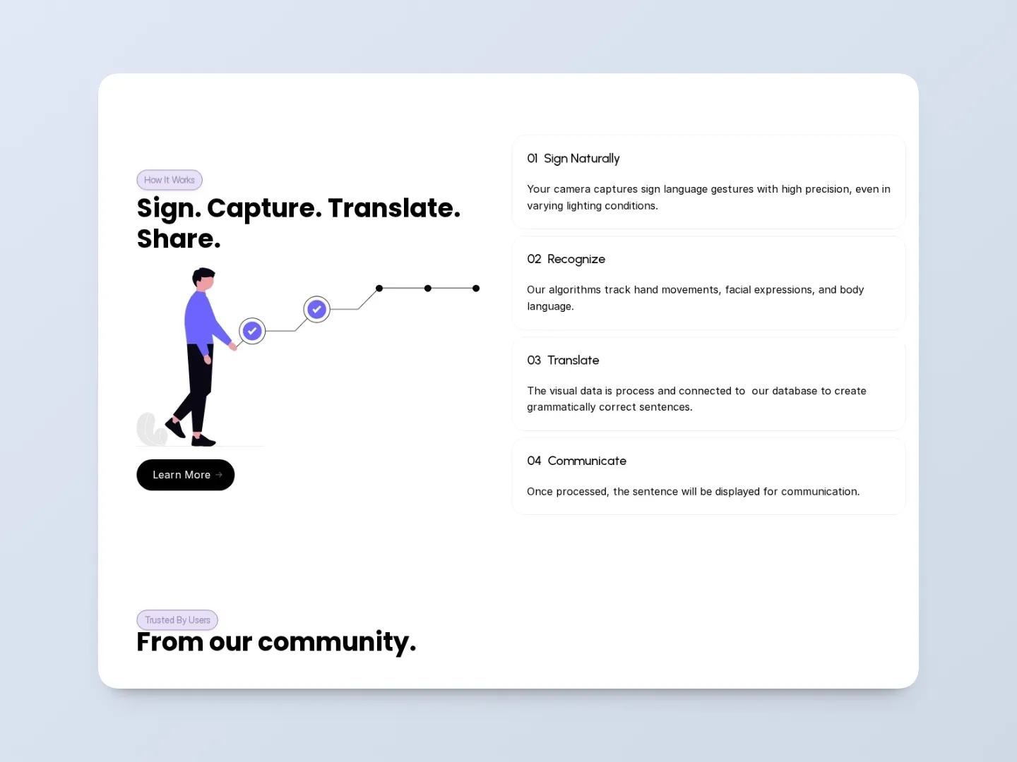
Home: hero, about, demo, process, testimonials, contact
How does it work?
Product: overview, process, availability, contact
Who is behind it?
About: story, values, team, contact
How can I get involved?
Contact: FAQ and form, roadmap, research, testing, contribution
The site used reusable layouts and a consistent type hierarchy so the experience remained understandable without relying on product imagery.
Outcome
From a short initial brief to a launched public website.
Squirl Signs launched its first public website in May 2026.
- Public presence established. The product, mission and participation paths became accessible in one public experience.
- Multiple outreach paths. Users, research participants and partners could reach relevant information faster.
- Structure carried forward. The information architecture and visual direction later informed the team's coded version after completing the product development.
Reflection
When product assets are limited, information architecture becomes the product story.
- Validate earlier with target users. I would test the IA, terminology and key content with Deaf and hard-of-hearing participants before committing to the build.
- Define success metrics before launch. I would track waitlist submissions, research interest and partnership inquiries so future changes could be based on behavior.
Squirl Signs has since evolved beyond my original Framer version: squirlsigns.com, Please take the time to support them!