Overview
Designing a marketplace students can trust
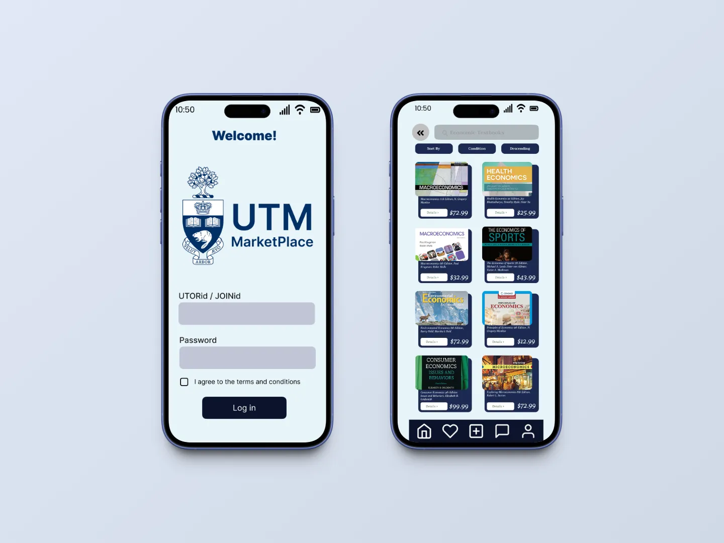
UTM Marketplace is a campus marketplace concept for students buying and selling items such as textbooks.
I worked in a five-person team across research, wireframing, prototyping and presentation, focusing on trust, navigation and transaction safety.
Design goal
Challenge
Existing marketplaces aren’t built for a campus community
Our research surfaced recurring problems with finding the right item, judging listing quality and arranging safe exchanges.
Research questions
Where do current buying and selling methods break down?
What information do students need before buying?
What would make an exchange feel safer and easier?
Scope
We focused on the core buying and selling experience. Payments, backend authentication and production development were outside the project.
Process
Research first, then test the concept
5
contextual inquiry interviews
7
themes from contextual inquiry
5
prototype / participatory sessions
Contextual inquiry
- Five participants aged 19 to 25
- Observed buying and selling behaviors
- Coded transcripts into an affinity map
Participatory design sessions
- Five one-on-one sessions
- Prototype walkthrough and feedback
- Findings grouped into five themes
What the research showed
Findability
Students struggled to locate the right version of an item.
Product information
Students wanted more detail before deciding to buy.
Security
Students worried about scammers and unsafe meetups.
“Some websites are giving me the 5th edition and 2nd edition, so it’s pretty frustrating that I need to make sure that I’m looking at the right textbook.”
“[I] could put myself in some dangerous situations I never know when meeting up.”
Key decisions
Require UofT verification. Tie marketplace access to a UofT identity to reduce uncertainty around who users are dealing with.
Trade-off. A closed community still does not eliminate account-security risks.
Add seller ratings and reviews. Give buyers a visible signal of a seller’s past activity.
Trade-off. New sellers start without a reputation.
Designate on-campus exchange spots. Move meetups toward predictable, familiar locations.
Trade-off. Testing showed that a map alone was not enough; users wanted clearer location detail.
Simplify navigation. Use categories, search and filters instead of more complex browsing patterns.
Trade-off. Some testers still found parts of the navigation excessive.
Solution
A campus marketplace built around trust
The prototype covered the core buying and selling journeys, with trust features appearing at key moments:
Testing the prototype
Five students and alumni tested two scenarios: buying an item and selling one securely.
What worked
- UTORid verification and seller reviews supported trust
- Navigation was generally easy to follow
- Participants understood the core buying flow
What needed work
- Payment, pickup and account-takeover concerns remained
- Some map, icon and label choices were unclear
- participants wanted more listing information but fewer navigation controls
Conflicting feedback required prioritization
Outcome
A tested concept with clear next steps.
Testing reinforced three priorities:
- Verified access to establish a trusted community
- Seller credibility through ratings and reviews
- Safer exchanges through designated campus locations
It also exposed unresolved issues around account security, pickup clarity and interface complexity.
Study limitations
- Small sample size. Five participants, mostly aged 19–25.
- No task metrics. We collected qualitative feedback rather than completion rates or time-on-task.
- One-on-one sessions. The format limited group collaboration.
Reflection
Trust has to be designed into the whole experience.
Verification alone was not enough. Seller reputation, meeting locations and interface clarity all affected whether the marketplace felt safe.
- Recruit a broader participant group. Include students with more varied ages, backgrounds and accessibility needs.
- Measure task performance. Track completion rates and time-on-task alongside qualitative feedback.
Later Context
UTM later introduced a separate Community Marketplace for faculty and staff. It is unrelated to our student concept, but reflects the broader value of exchange within a trusted campus community.